Beta

This is a new service and pages are being tested and improved.

Overview

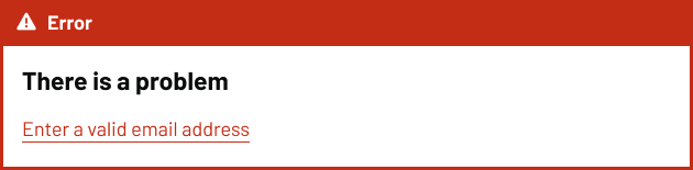
An error summary let’s users know about form validation errors by displaying all problems in a single location at the top of the form.

It helps users quickly identify what went wrong and provides direct links to the specific fields that need correction.

Example

An error summary banner with a red background and a warning icon followed by the word ‘Error.’ Below, bold text says ‘There is a problem,’ and an error message reads ‘Enter a valid email address,’ underlined in red.

When to use

Use the error summary every time there’s a required field and the user hasn’t met the validation criteria on the form.

When not to use

Avoid the error summary component when:

  • there are no form validation errors
  • you need to let users know about service disruption or general information
  • showing warnings that don’t prevent form submission

For system-wide issues or service announcements, use a notification banner above the page content.

Content notes

For the heading, always use ‘There is a problem’ (without a full stop). This is a Heading 3 displayed as a Heading 4.

Then provide the error message which has been set for each field, as a red link on it’s own line, without a full stop.

Back to top