Beta

This is a new service and pages are being tested and improved.

Overview

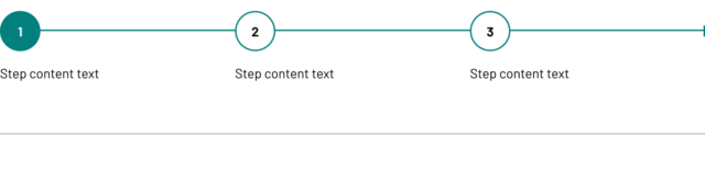
The progress indicator provides a visual representation of a user’s progress through multi-step workflows that span several pages.

It shows users their current position and overall progress through three or more sequential steps, appearing consistently at the top of each page in the workflow.

Use progress indicators to help users understand where they are in complex process.

Example

Horizontal progress indicator showing three steps. Step 1 is a filled teal circle with the number 1, steps 2 and 3 are white circles outlined in teal with numbers 2 and 3. A teal line connects all steps.

When to use

Use progress indicators when you need to:

  • guide users through separate multi-step processes
  • help users understand how much of a process they’ve completed and what remains
  • provide navigation back to previous steps in linear workflows
  • display progress through structured guidance or training materials

When not to use

Don’t use progress indicators when other navigation patterns work better.

Use step by step navigation instead when:

  • users need an overview of the entire process before starting
  • users need detailed guidance about what each step involves

Use tabs instead when:

  • users need to jump between non-sequential sections
  • content is organized by topic rather than workflow sequence

Use single-page forms instead when:

  • the process has fewer than 3 steps
  • all information can be collected efficiently on one form

Avoid progress indicators when:

  • steps vary significantly in complexity or time required (this creates false expectations about progress)
  • users frequently need to skip steps or complete them out of order
  • the workflow isn’t truly linear or sequential

Content notes

Write clear, actionable step labels that help users understand what they’ll accomplish.

Step naming

Create consistent, descriptive labels that work across the entire workflow:

  • use action-focused language that describes what users will do: ‘Enter your details’, ‘Upload documents’, ‘Review and submit’
  • keep step labels similar in length and format for visual balance
  • avoid technical jargon or internal process names
  • be specific about what each step involves: ‘Provide contact information’ rather than ‘Personal details’
Back to top